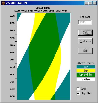
The Yearly Visibility Plot shows when Jupiter and the Sun will be above the horizon throughout any given year. This is a computationally intense routine and can take several minutes on a slow computer, especially in Hi Res mode. Still, the plot can be quite valuable in planning the best observing times during any given year. It is also interesting to see how the patterns change over a number of years. You can also see the difference in patterns due to latitude.
The time scale for the day is in local time with no account
taken for Daylight Savings Time as this would destroy the continuity of
the plot.
Put the year you want to plot in the Set Year box and press Calc. The Next Year button populates the Set Year box but does not update the plot. You have to press Calc again for that. Below the Exit button is the key which shows the meaning of the various colors plotted. The Grid check box throws three hour vertical time bars on the plot, but running the mouse over the plot gives more precise time coordinates. Finally there is a choice for Hi Res mode as shown here. This takes about twenty times as long, but gives the nice smooth plot. Left unchecked the plot is blocky but draws much faster. |